现象
页面加载完毕静置一小会之后,CPU 使用率居高不下,风扇巨响,发热严重。关闭页面后现象消失。
重现方式
$ git clone https://github.com/AlphaHinex/AlphaHinex.github.io.git
$ cd AlphaHinex.github.io
$ git checkout cdf1d11
$ npm install
$ npm audit fix
$ cd themes/obsidian
$ npm install
$ cd ../..
$ hexo server
看到如下提示后,访问 http://localhost:4000
INFO  Start processing
INFO  Hexo is running at http://localhost:4000 . Press Ctrl+C to stop.
在首页或打开博文页,观察 CPU 使用情况。如下图:
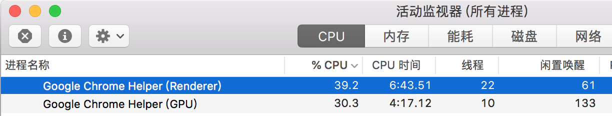
在页面静置时,Google Chrome Helper (Renderer) 的 CPU 使用率在 30% 以上至 40% 左右,Google Chrome Helper (GPU) 的 CPU 使用率也稳定在 30% 左右。滚动页面时,这两个进程的 CPU 使用率会继续上升。
定位
页面上的内容都已经加载完了,上面 Renderer 和 GPU 两个进程还在持续使用这么多 CPU 资源,显然是不合理的。那么怎么找出罪魁祸首呢?
任务管理器
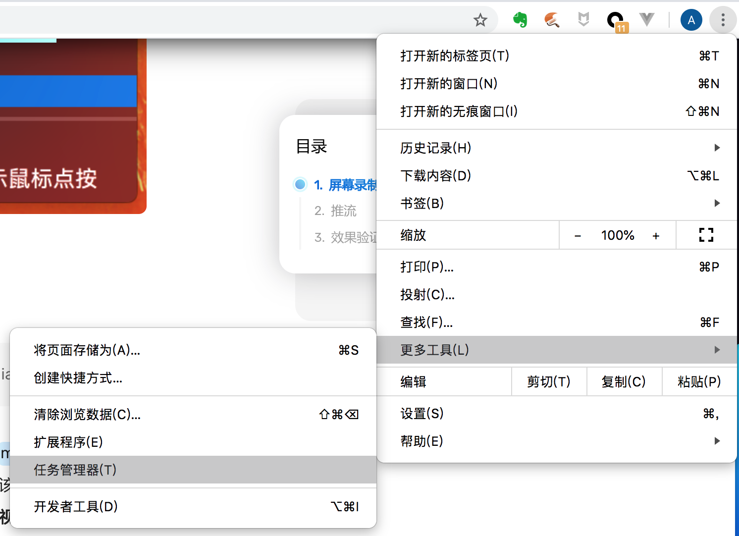
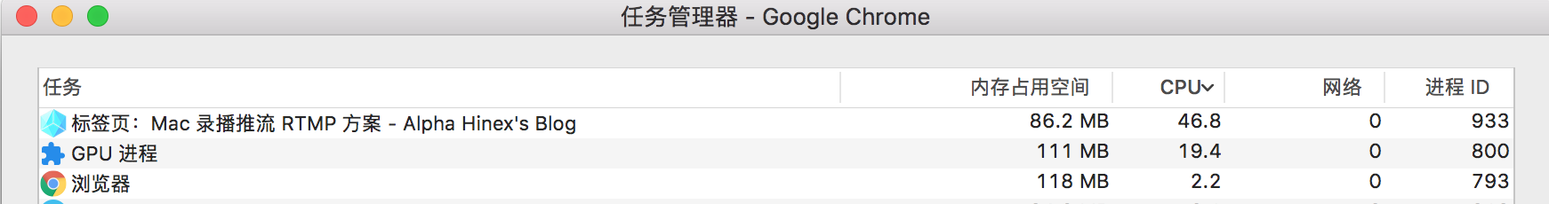
在 Chrome 的 任务管理器 中,可以直观的看到是哪个标签页消耗了过多的资源。
Rendering
操作系统和 Chrome 的任务管理器,都将问题指向了页面渲染。但是从界面上,并没有看到明显的在持续渲染的内容,也就不容易定位到具体的问题。这时可以使用 Chrome 开发者工具中提供的 Rendering 工具,位置如图:
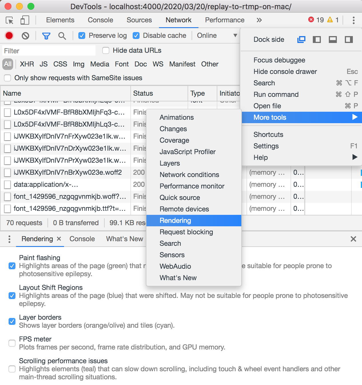
打开 Rendering 后,如图勾选三个选项:
- Paint flashing
- Layout Shift Regions
- Layer borders
之后再看下界面,可以发现一些蛛丝马迹。
从动图中可以看到,界面上共有三处动画:
- 左侧中间位置蓝色方块(不开 Layout Shift Regions 在页面上根本看不到这东西)。这个是页面 loading 效果,在 loading 结束后,被设置为了透明,虽然看不见,但实际仍然在持续的进行渲染
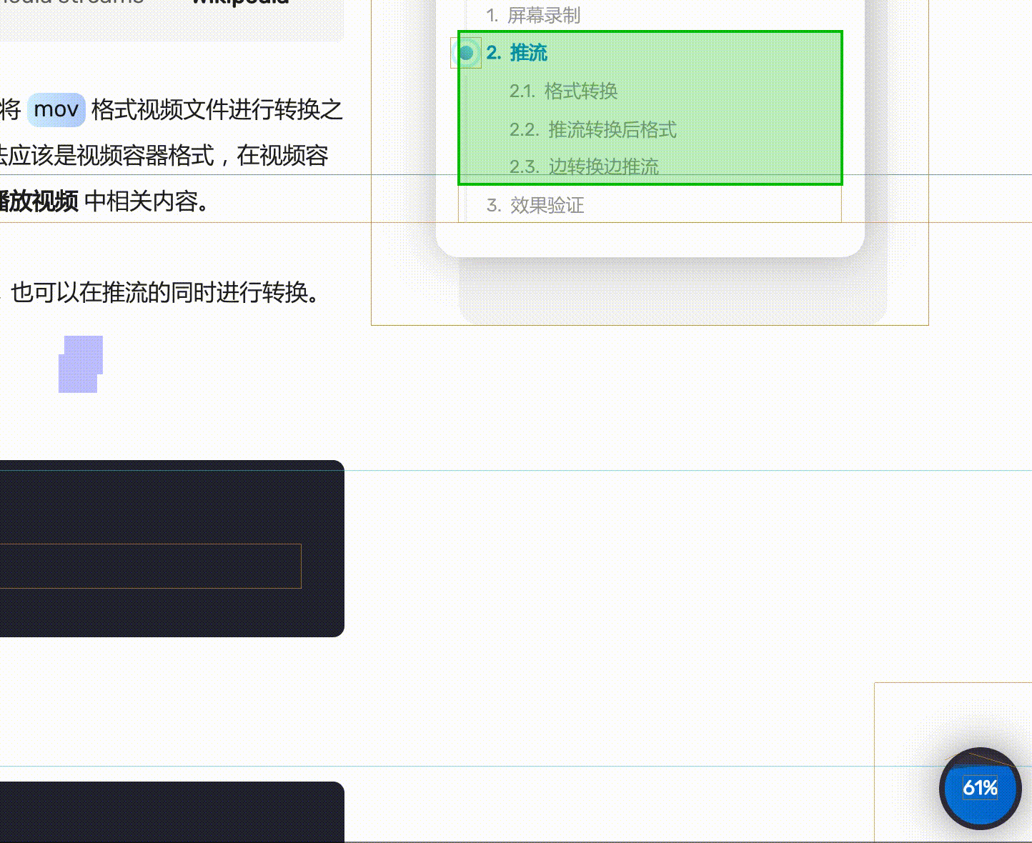
- 右上 TOC 处原点扩散水波纹效果
- 右下百分比处水浪效果
解决
定位到了问题,解决起来就容易了。
- loading 效果原来的处理方式是通过设置透明变为不可见,可调整为在不需要的时候直接不显示。
- 另外两处无限循环的效果,简单粗暴的处理方式可以直接不进行效果的循环,或者将 CSS 动画改为 gif 动图,可显著降低 CPU 使用率。
参考资料中的
translateZ(0)、will-change等方案,在本例中并未发现明显效果。
改动内容可参考:
diff --git a/themes/obsidian/source/css/obsidian.styl b/themes/obsidian/source/css/obsidian.styl
index eebc3fa..6b7494a 100644
--- a/themes/obsidian/source/css/obsidian.styl
+++ b/themes/obsidian/source/css/obsidian.styl
@@ -18,13 +18,14 @@ body {
   line-height: 2;

   .loader {
+    display: none;
     width: 100vw;
     height: 100vh;
     position: fixed;
     top: 0;
     left: 0;
     transition: opacity 600ms linear;
-    opacity: 0;
+    opacity: 1;
     z-index: 1000;
     background: #100e17;

@@ -100,7 +101,7 @@ html {

 body.loading {
   .loader {
-    opacity: 1;
+    display: block;
   }


@@ -319,9 +320,6 @@ img.spin {
   position: relative;
   z-index: 0;
   border-bottom-right-radius: 180px;
-  -webkit-animation: GradientEffect 1.2s ease infinite;
-  -moz-animation: GradientEffect 1.2s ease infinite;
-  animation: GradientEffect 1.2s ease infinite;
 }

 .screen-gradient-content {
@@ -1164,7 +1162,7 @@ footer {
       opacity: 0.4;
       border-radius: 45%;
       transform: translate(-50%, -70%) rotate(0);
-      animation: rotate 6s linear infinite;
+      animation: rotate 6s linear;
       z-index: 10;
     }

@@ -1175,7 +1173,7 @@ footer {
       background: linear-gradient(var(--dark), var(--secondary)) !important;
       opacity: 0.9;
       transform: translate(-50%, -70%) rotate(0);
-      animation: rotate 10s linear -5s infinite;
+      animation: rotate 10s linear -5s;
       z-index: 20;
     }
   }
@@ -2351,7 +2349,6 @@ h1.title {
           left: -8px;
           top: 1px;
           -webkit-animation: pulsate 1.2s ease-out;
-          -webkit-animation-iteration-count: infinite;
           opacity: 0.0
         }
参考资料
留言